Mythic Foundry
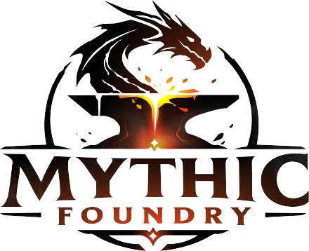
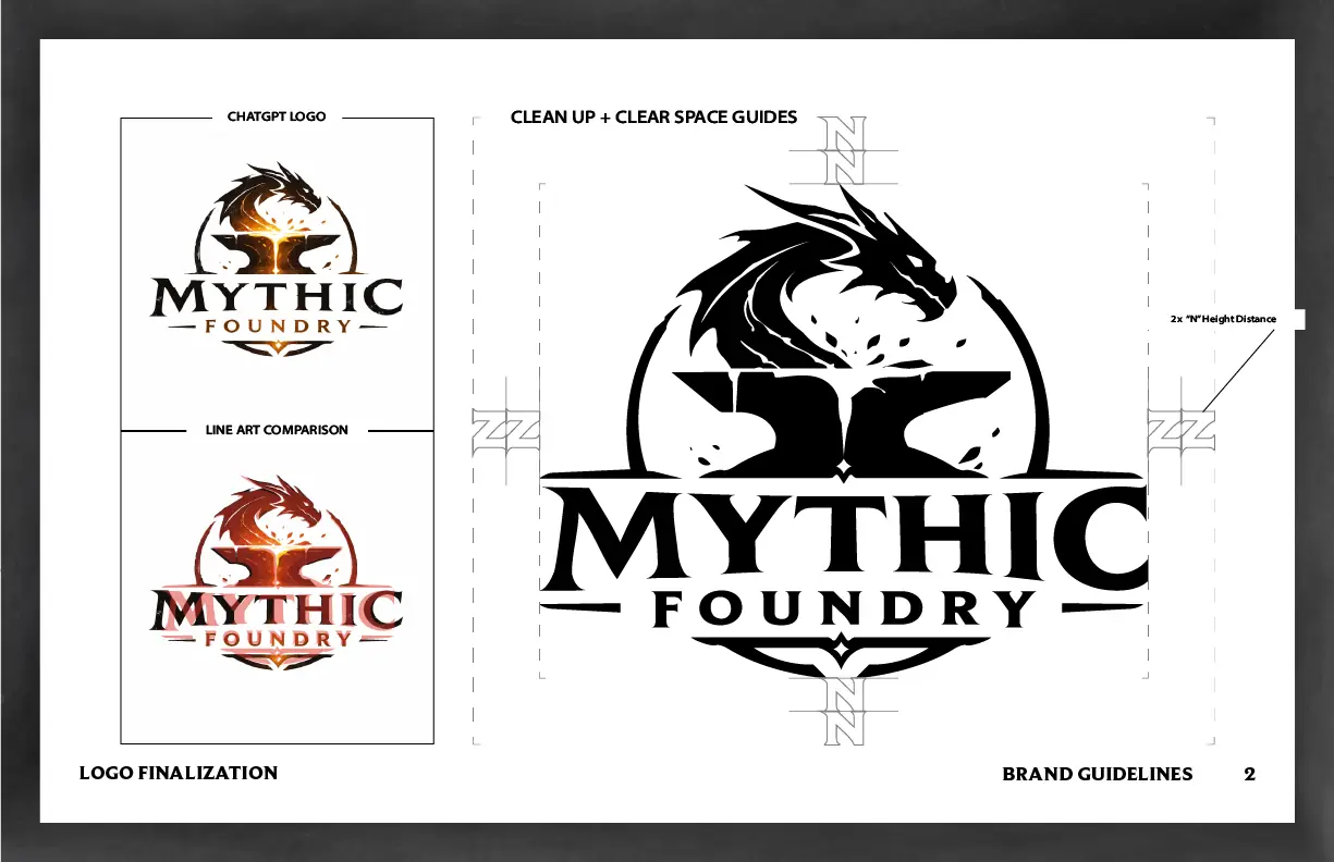
The client came in with an AI-generated concept for a dragon-and-anvil emblem — a strong idea, but unusable as a production logo: rough edges, inconsistent linework, no defined proportions.
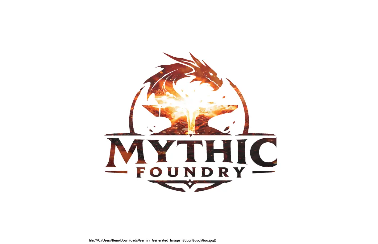
The job was to turn that concept into an actual usable mark: redrawing it as clean vector line art, defining clear-space and sizing rules against a strict grid, and building a full system around it — a "forge glow" full-color palette (warm amber, orange, and rust plus near-black and off-white, with exact hex/RGB/CMYK values) alongside a monochrome version for single-color use. Typography pairs BeaufortPro Heavy for the primary wordmark with Platypi Bold as a secondary face.
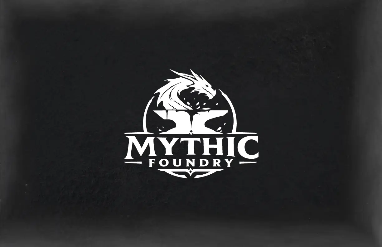
Deliverables were a complete brand guidelines document — the redrawn emblem in full color and monochrome, a transparent lockup, a small-format/favicon version, and explicit dos-and-don’ts for using the wordmark against different backgrounds.